
In this Design-a-thon event, it required us to come up with a way to teach others about the importance of prescribed burns. Prescribed burns are a man-made fire that is used to manage over-grown areas to prevent dangerous megafires from spreading and regulating vegetation, incredibly beneficial to the surrounding ecosystem.
Although experts like firefighters and burn handlers continue to protect communities from the dangers of wildfires, these professionals don't have a clear method to how might they educate individuals on the importance of prescribed burns. Most of society assumes all fires are bad, so this can cause unnecessary chaos and worry. Because of this, society will continue to perceive fires solely as a hazard, not realizing these burns are what keep us safe from other natural and environmental disasters.
How might we educate students in high-risk fire zones to learn the difference between wildfires and prescribed burns in order to reduce panic and promote safety when facing fire.
Plan, sketch and design an installation that will help spread awareness about prescribed burns within a 24 hour window. Understanding this, we broke up our process throughout the day - maintaining a clear path for success.

In beginning our process, we knew we wanted to target young students and families, educating them through a fun, yet informative experience. By targeting this specific group of users, it would help build an educational foundation, allowing them to understand the importance of fires at an early age.
As a group we had a multitude of ideas we first considered, including:
We put these ideas on paper, sketching possible scenarios on how might these function.


After some discussion and further research, we came up with the plan to create an augmented reality scavenger hunt for families and visitors near national parks. This idea would be developed into an app and the aim would be for users to travel and search for checkpoints, which they can find and learn more about prescribed burns, wildlife, and the environment around them. The app would essentially serve as a virtual tour guide as they hike and travel through through the park. After finding all locations, users would be able to redeem a prize at the end of their journey - incentivizing them to search and learn more about the wonders of fires.
.png)
While our vision seemed clear, it was simply not feasible. Lately realizing national parks have poor reception, the augmented experience wouldn't be able to function. This set us back quite a bit as we have already spent the early parts of the day, discussing and planning key features for this idea. Because of this we had to completely scrap the idea - move on and quickly come up with a new type of project. Although our plan fell short, leaving us behind on time, we continued to move forward.
With our original plan failing, we looked to our list of ideas for inspiration. Combining the engagement of an application and the interactivity of exhibits, we took these elements to create an educational experience for young students, moving our project away from national parks and into the class room.


Before diving into our final designs, we first created some low fidelity versions of the app screens, displaying: the profile, the courses, and the lesson plan in action. We needed to get a gist of how it would function and what kind of screens were going to be displayed. With time winding down, we dived straight into the final stretch for our product.


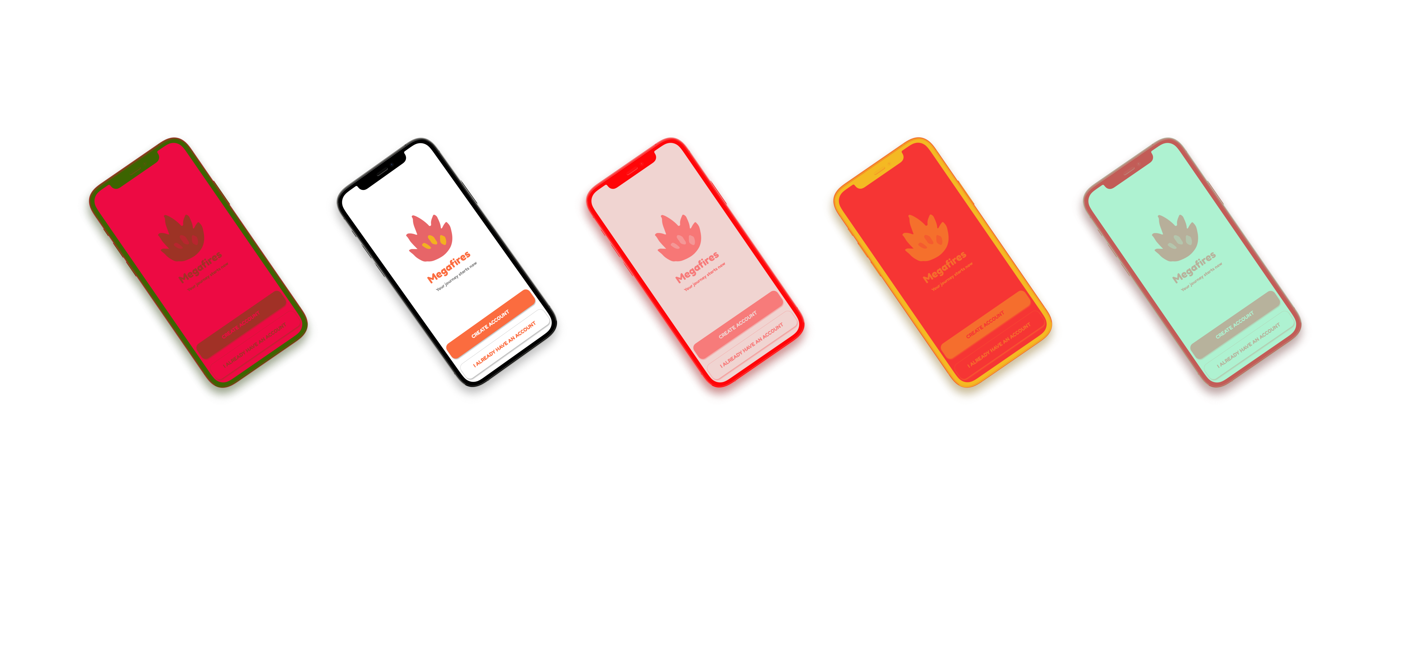
Because we knew kids were mostly engaging with the app, we needed to keep the app simple and concise, limiting the number of pages and text, so all can participate. Without this, it'd be too complex for even the youngest minds to handle.

Not only did we want to make this product aesthetically pleasing, we also needed to make sure it was made purposely designed for our users: young students. Taking inspiration from the language based learning app: Duolingo, we aimed to set a casual and uplifting tone with our project. Combining bold colors and cartoonish imagery, we wanted the application to feel welcoming and exciting. In addition to this, the lesson and learning screens for this app needed to be engaging, but also friendly, so we researched and mapped out its flow accordingly.
.png)
.png)
.png)


Looking back at the process, it was incredibly exhausting, but also very rewarding. One major aspect that stuck with me was the ability to work under pressure and overcome any sort of design roadblock. Although our first vision fell short, it was our persistence and steady planning that allowed us to deliver a worthy product in the end. This was also a great test to my own UX thinking process - where I needed to understand and distinguish who is being affected and the problem at hand.
For the future of this design, this was an ultimate stepping stone for me and I hope to continue to develop and design more products like this for the community at large. One aspect about this process that I wished I did differently was undergoing more research and clearly understanding the details to an idea. Our vision for the scavenger hunt installation truly crashed our design process, forcing us to abandon it and think on the fly. If we were to map out the logistics and details behind each plan, we would have been able to save time and come out with an even more polished product.

