

As gas prices rise - this creates more focus for people to transition from gas powered cars to electric vehicles (EV), ultimately reducing fuel emissions and pollution. While EV's offer a range of benefits and qualitative services, its not always clear what sort of EV users should purchase and how to properly maintain it. Other related topics arise such as charging stations, maintenance and personal lifestyle budgeting, which can all be difficult to manage and learn without guidance. In this case, my team and I have created EVolve - an all in one EV tool that will help both prospective buyers and current owners connect and learn everything EV.
How might we help prospective buyers learn more about the technical and financial aspects of owning an EV in order to facilitate a global transition to EV's?
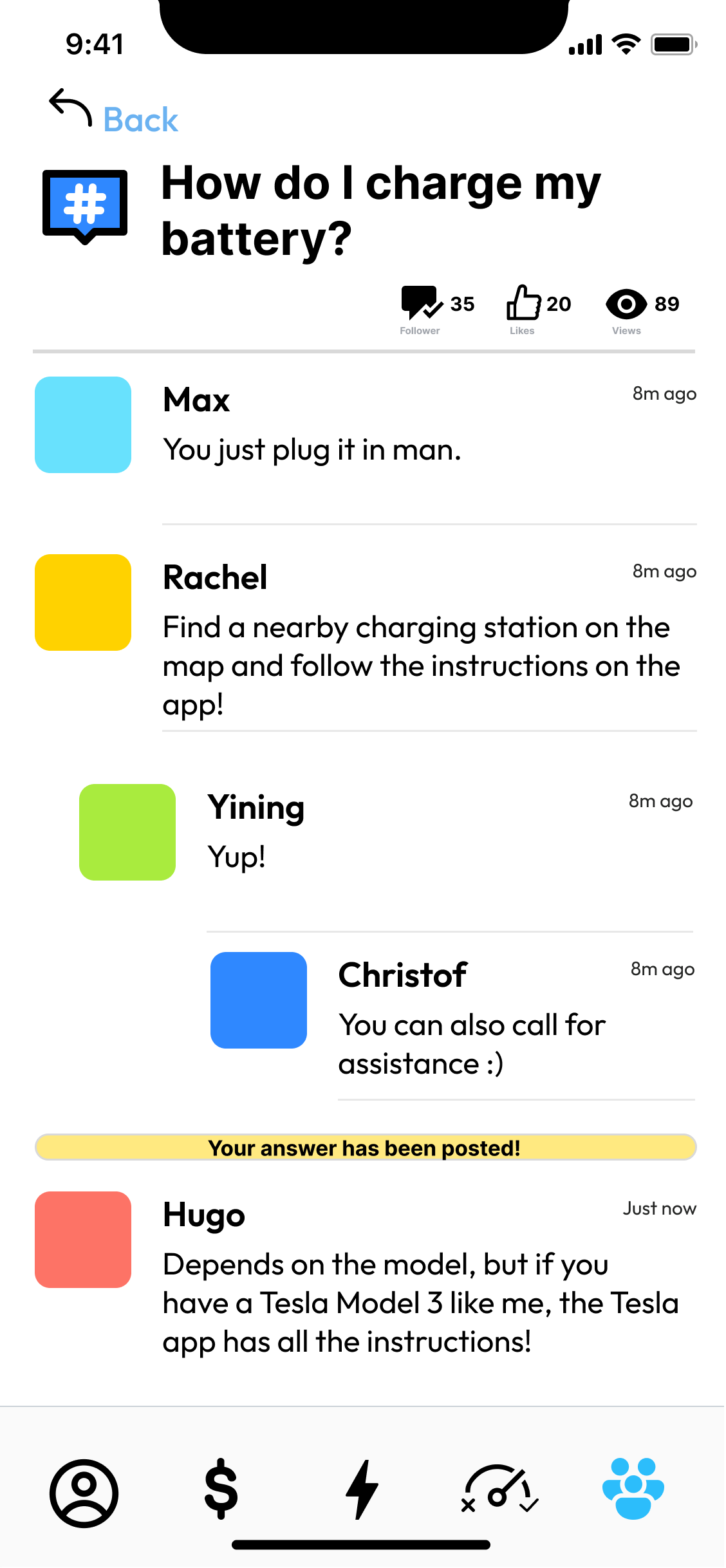
How might we also create a community dedicated to EV owners and prospective buyers in order to connect and establish a support system for users seeking assistance?
Yining Qi, Rachel Paner, Christof Kopera, Max Arias
Create an interactive and innovative mobile information system to address user needs or desires focusing on preserving the environment and reducing waste.

We began our project with user research, analyzing possible constraints, problems, and potential solutions revolving around EV's. It was vital we find that north star. While we found an array of issues and hurdles to overcome , isolating and highlighting those key conflicts was important for our future designs as we didn't want to improve every single aspect, but truly hone in on users struggle and question how might we improve those limitations moving forward.

From our insights, we were able to frame these problems into three main categories users often face when owning and possibly purchasing EV's:
After categorizing these elements we discussed and questioned how might we approach each specific user scenario. Some of our proposed ideas included various application tools that tailored to the users life style and location. Based on the users input for example, the app would suggest vehicle compatibility , offer budgeting plans, and a radar system that would locate nearby help as well as charging stations. There was a multitude of factors to consider when choosing what and how our app should operate, so it came down to determining how EVolve can stand out and improve on existing systems to help better support user experience.

With our north star in mind, we began to illustrate and sketch these problems through storyboarding - analyzing the context, the problem, the solution, and resolution on how might individuals interact in specific scenarios. These scenarios cover elements like figuring out personal financial plans, matching with the right vehicle, and locating nearby help. This sort of context allows us to map the users journey, introducing different problems at hand and depicting how certain solutions will lead to a positive outcome.


Before creating and testing our wireframes, we then moved onto creating our user personas, to scope who specifically we would target and how they would benefit from our system. Using a combination of interviews and user research, we built two personas based around both Prospective Buyers and Current EV Owners.


Following our research and storyboarding, we began the wireframing between each screen, creating the possible layout and interactions. While not the most aesthetic designs, these first iterations would help build the basis for our upcoming prototypes, establishing how the application would function and the sort of features it will include.

Because the app was entirely based on the users wants and needs, introductory questions as shown above were necessary to filter how EVolve can help support user issues, whether it be shopping for a new car or seeking personal help.

After settling into the app, users would be able to take advantage of all the various community support options and budget building resources to help learn more about EV's. This was only the beginning.
In order to scope the navigability and function for our wireframes, we conducted a simple short-task interview from students to EV owners. We found that many of the subjects were able to go through each screen with ease, however the main concerns for our system was to:


Following our critiques, we were eager to start honing in on our first mockups. While developing these low fidelity versions, we began to add more personality and flair within the app, testing layouts, color schemes and fonts to create a vibrant yet minimalistic tone. Establishing the mood for our system was important to consider as it would help establish what EVolve is and how our system encourages user support and guidance. Cleaning up the interaction and flow between each screen was also a major stepping stone for us at this point.

With the aesthetics beginning to emerge, we also needed the interface and overall experience of EVolve to flow smoothly as well. Each screen was complimented with new icons and images, effectively illustrating the purpose and role for each given function - community help , car matching, charging locator and more.
As our system improved, the overall look and experience came to life. While there were still edits to be made such as cleaning up the prototyping and clarifying specific functionality between certain screens, we were surely headed in the right direction.


.gif)
.gif)

After our final iterations and edits, we were able to achieve a solid basis for EVolve. The interaction and system itself functioned smoothly, displaying a wide range of benefits for both EV owners and prospective buyers. Because our application combined a variety of tools, it was important for us to emphasize the most critical solutions and options for EV related problems, allowing users to find and overcome any given conflict using EVolve.
One major improvement and change to be made from this project would be accelerating and diversifying the mockups and low/high fidelity versions of our work. While we were able to complete and design the foundation for our application, the interface and flow of EVolve lacked diversity and change. The design of the project sort of stayed consistent throughout the course of its time, until the final weeks before completion. By expanding and differentiating certain elements, my team and I would have experimented with alternate versions of EVolve, leading to a whole new experience separate from the product we've completed. For myself and my team, we've definitely learned how and what steps we should take when we move forward with user designs and experiences, leading to a much organized process overall.

