

Imagine a family member or friend is unable to care for themselves due to some medical condition or old age. Because they aren't able to live on their own, they are forced into a Conservatorship, an organization that effectively looks after not only your friend or family members' health, but their money and property as well. Already, this can seem like a worrying scenario, considering a stranger is now in charge of your loved ones life entirely, deciding their fate and controlling their decisions.
Although at first glance this organization is supposed to look after their patients' well-being and belongings, this is not always the case. Conservatorships often exploit these helpless people for personal gain, ultimately prisoning them. This issue is often disregarded and underappreciated since many don't understand the significance of these organizations and their meticulous motives.
Conservatorships utilize their positive and supportive image in order to exploit the vulnerable and their patients, often stealing money and property from their victims for their own personal gain. Because of this, patients are manipulated and taken advantage of with no escape.
How might we educate users to recognize how Conservatorships are extorting patients in order to create a safer environment for victims of abuse?
Redesign the Conservatorship Reform website, revamping the interface for easier accessibility and navigation, while also bringing awareness to abusive organizations and their exploitive methods.

With a brief scan of the current website, it was immediately obvious why it failed to reach its target audience.
The current site contained a multitude of issues that contributed to this, including:
With these violations in mind, this explained the low user engagement and traffic, which made it difficult for our client to draw in donations as well as social/political support for their cause.
Our client did not necessarily agree with some of the design choices and future direction for the site. We worked around this by accommodating to their needs while still improving and updating the website. While they were hesitant to change certain elements, it was our job to redesign and test why our vision worked best.


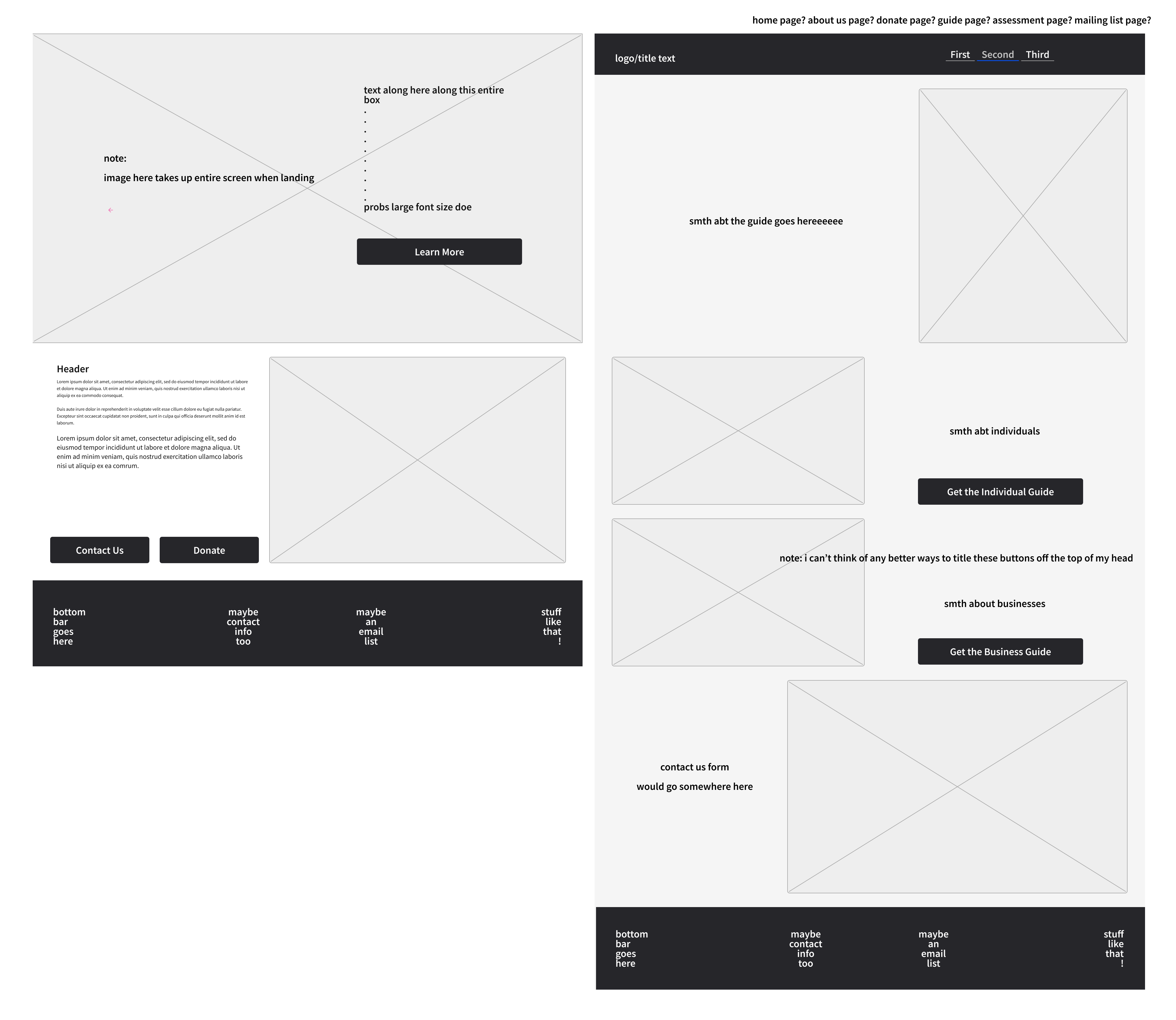

From adding a new layout, to new images, the site was slowly evolving into a more navigable page. Text was cut down, images were added and important information was highlighted allowing users to understand what conservatorships are and how they can help. Because the current site lacked proper formatting and interface control, this aspect was the most important feature we wanted to change. With a combination of these elements it helped clarify what design direction we needed to pursue and how.


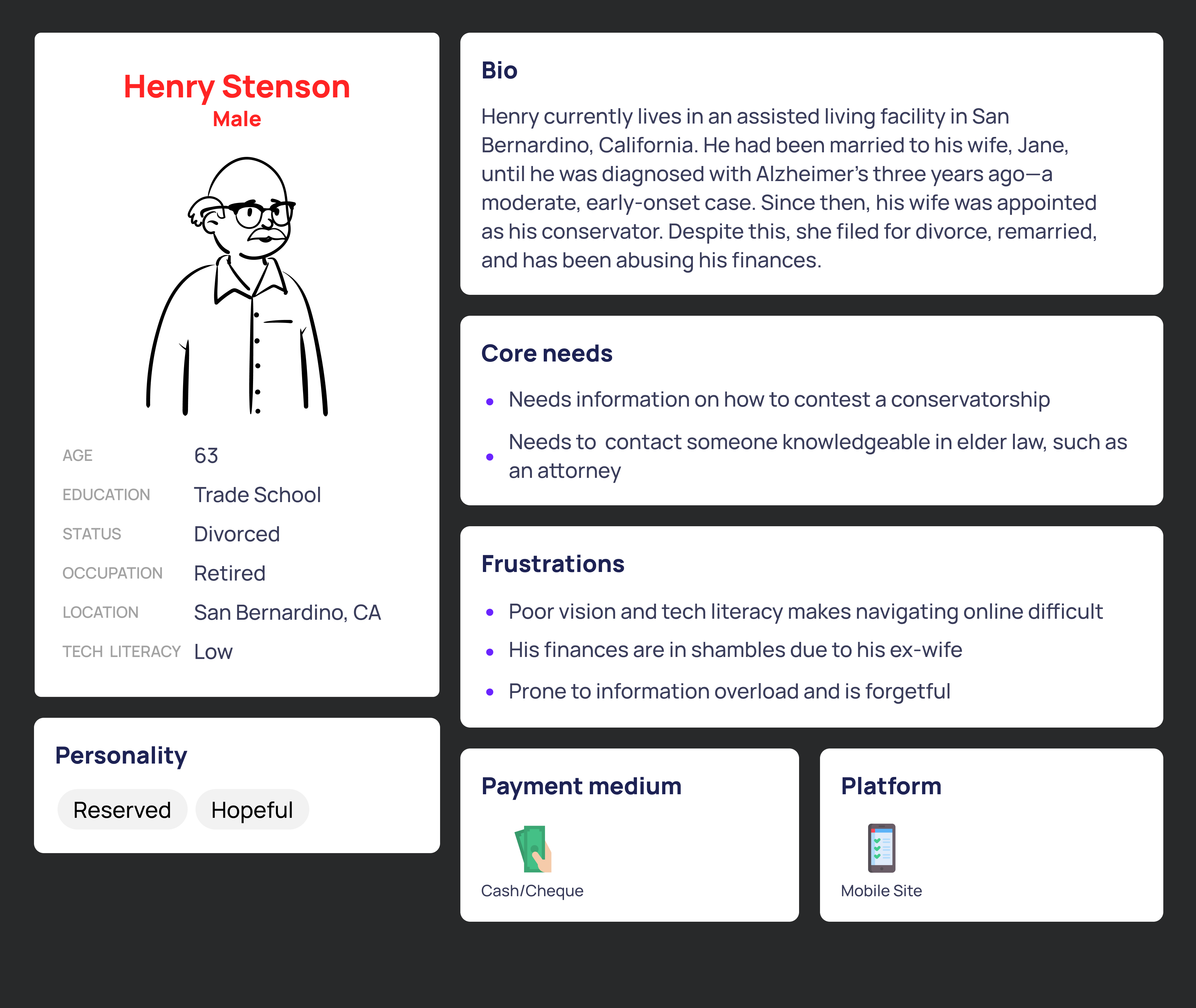
In order to gather meaningful feedback, we wanted to target and survey the most relevant users associated with Conservatorships.
After surveying about 40 participants, questioning how well and how effective they are able to navigate through our initial prototypes, we were able to determine what design elements they liked:
In addition to this we also found that users dislike elements such as:
For our first round of prototyping, the team not only wanted to emphasize clear site navigability , but to also illustrate a compelling story telling process as well. In order to do this, we wanted to implement more images along with captions to help the user visualize the struggle behind Conservatorships, sort of like a graphic novel - depicting emotion and real life patients. The menu bar was moved to the top of the page as opposed to being hidden in the corner to allow users to approach the site with confidence. We also planned to create a slide show along with bolded links to attract and guide the user. We simplified the home page to highlight important aspects, such as donation options and the consultation form, both helpful resources.


Looking back at this process, we we were able to create a more elegant and informational website. Although there is always room for improvement, we were still able to overcome any challenge we faced, whether it was user feedback or constant prototyping. We delivered a refreshing product that resolved many of the sites current issues, allowing users to more easily browse and learn more about Conservatorships and how they can help.
For the future of this work, we have passed our product to a new group of designers to iterate and update any necessary changes for our client: Conservatorship Reform. Because of this, we have built a solid foundation that will continue to help teach users on the impact of these social issues.

